Category: Illustration

  • “Religion is a language virus”

    True Detective is a strangely fascinating show. Sometimes I feel like I’m not smart enough to understand it, but then it hits you with some hauntingly evocative Louisiana vistas and I just keep on watching.
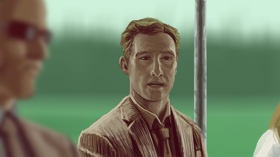
    Drawing Matthew McConaughey is not easy. He turns into Arnold Schwarzenegger too easily with a few wrong lines. I’m not too happy with the likeness but the lighting turned out fine and it’s not like it needs to be perfect so there it is.
  • Crosshairs and Markers

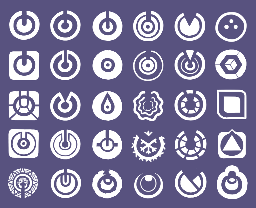
    Some early designs for a lock-and-key mechanism in a game I’m working on.

  • Sochi

    I was doing some backgrounds for a work-for-hire project and this one turned out pretty cool when I thought it was going to be dumb. Fun how a speedpaint can sometimes surprise you with the outcome.

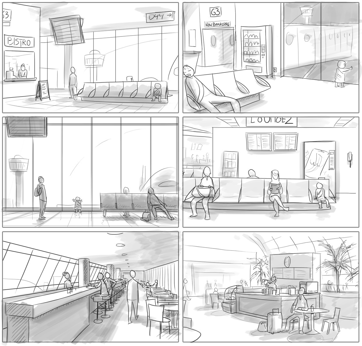
  • Holding pattern

    A few sketches for an old project. I love airports. Lots of ways to make an airport lounge interesting as an interactive space.

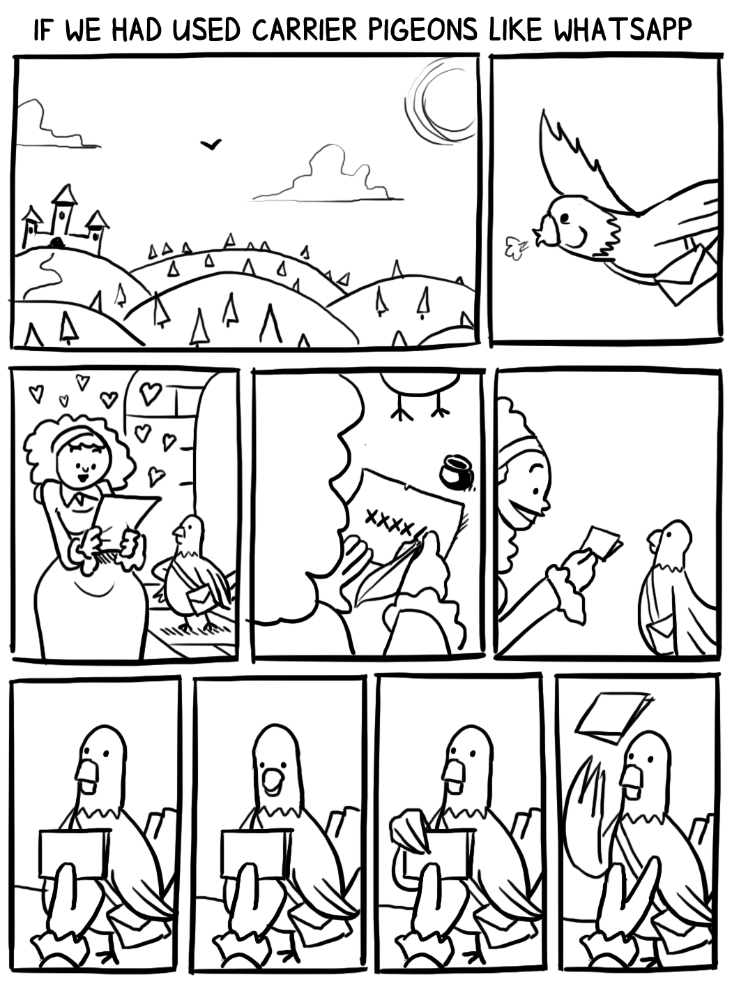
  • Harry the carrier pigeon

    How did people ever manage without Whatsapp?

    Resulting from a fun conversation the other day, I was compelled to draw a scenario where people communicate as we do today but using the means of old.

    It became an interesting exercise in timing. I read this blog post the other day and was made to remember how excellent the Sad Pictures For Children are in their comedic timing. Like really top of the line.

    The blank-faced pigeon tossing away the note makes me laugh every time.

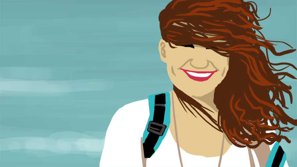
  • Esther

    Half hour paint to flex the coloring muscles. I was going to add more detail but concluded that it didn’t really need it.

  • Stop smoking

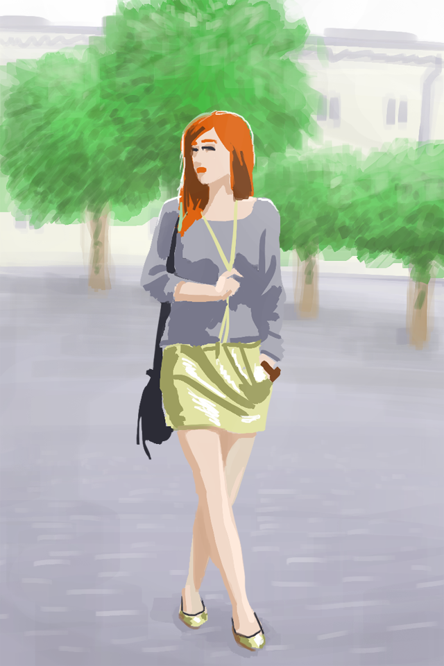
    Sometimes I turn a corner somewhere and I am hit by a stunning composition that I just want to draw. Today I walked out of Bijlmer ArenA station to the busstops and the midday sun cast everything in a silhouette, in the middle of which, this.

    Bonus challenge: is she facing you or facing away?

  • Gestures

    I’ve never really been to a life drawing class, which seems odd for an art student, so recently I’ve been thinking about going to one when I came across a really cool tool that infinitely doles out random life drawing poses, so I just sketched a bunch!

    On each pose I took a maximum of two minutes. With some you can still see the lines of action (or “swooshes” as Joeri Lefevre likes to call them) with which I started the sketch. It’s useful to first capture the motion of the entire body in a single line and then start building up the drawing from there.

    Detail on the one I think turned out the best:

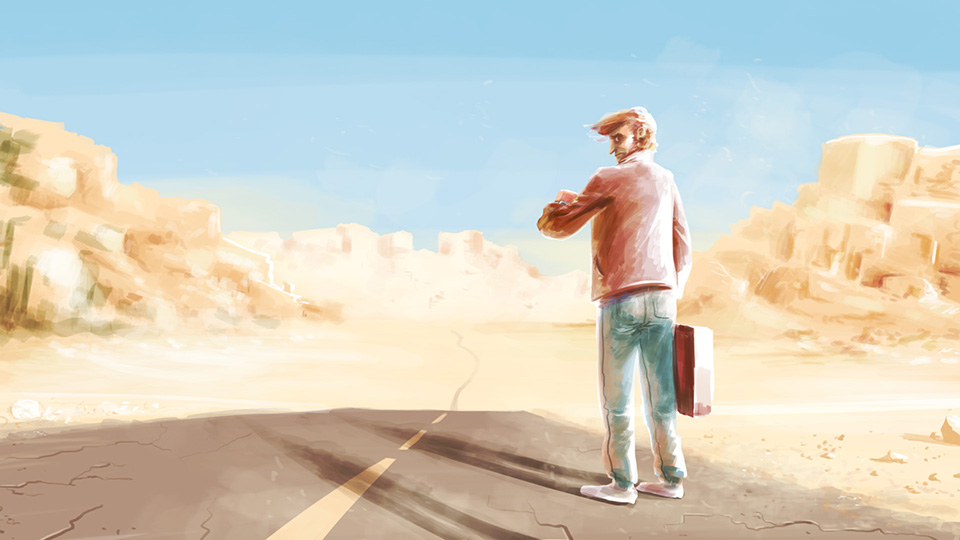
  • Late

    I wanted to do a simple free painting again today, not for some specific project or goal, but I wanted it to convey a story without words. So I sat down and drew the first thing that came to me.

    Face detail:

    It’s funny how drawing Off-stage has influenced the way I draw noses.

  • MIB

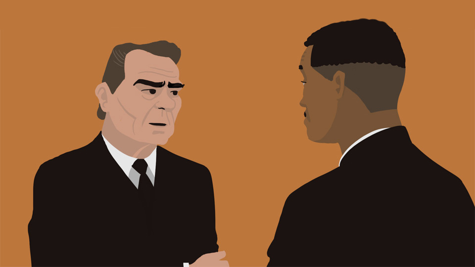
    Seeing Men In Black again recently I realized it is up there as one of my favorite movies. I was going to paint this frame but then I thought ‘no, where’s the challenge in that, let’s try something else – see if I can get these iconic faces down in as little shades as possible.’

    Arguably the earlier version where Tommy Lee Jones’s eyebrows were the only thing on his face was even more iconic, but with the extra shades it looks just a little bit nicer. Hardest part though was the shape of Will Smith’s three-quarter head.

  • Willie process

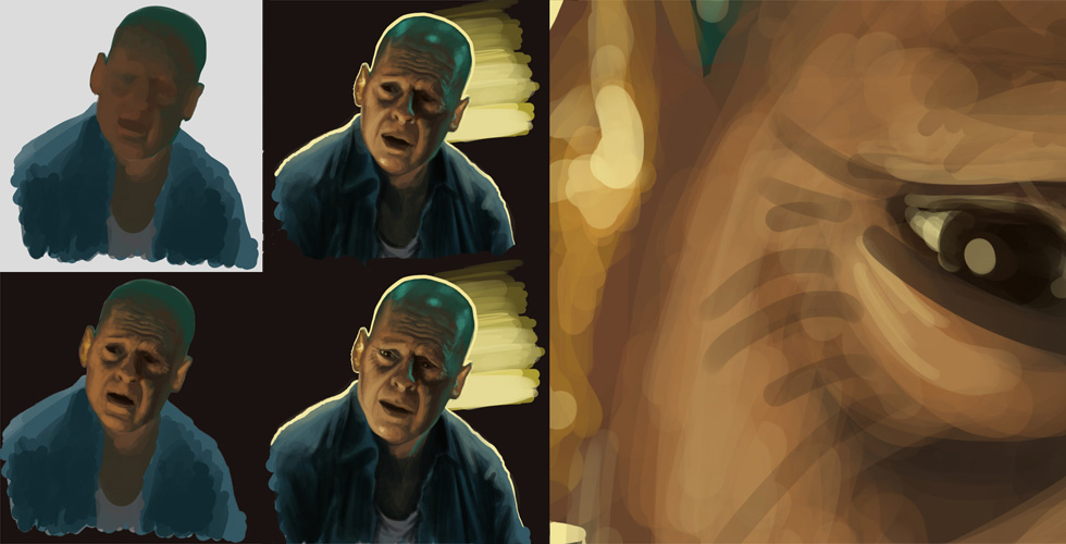
    Below is a little chart of the process on the Willie painting. When I paint realistically I don’t usually do a line sketch, I just go to town with big blobs of color. Well, in the cases of these moviestill paintings at least, since I already have the composition by looking at the framegrab, so no sketch is needed. I just sort of estimate the proportions and refine as I go along.

    On the right you can see the sweet detail that the Mischief vectors bring. You don’t have to set a canvas size or resolution, you just start painting and whatever size you need it as you enter in the export dialog and it takes care of it for you. Massive headache saver.

  • Willie

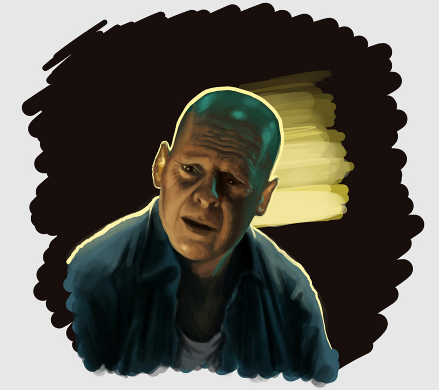
    I watched Die Hard 5 recently, and this scene captured my attention. I had to paint it, it has everything: rimlights, specular highlights, subsurface scattering, indirect global illumination, bruce willis…

    I didn’t do this one in Photoshop but in Mischief! Gabe from Penny Arcade pointed me to it, and it is pretty incredible.

    What you see below are vectors.

    That’s right. You can paint as if it were pixels, there are brushes with pressure sensitivity and opacity settings, but everything is infinitely zoomable. And the resulting file was only 300 kb! It’s lightweight, responsive, and only $65. It might be a few features and hotkeys away from bumping photoshop from the top spot for me in terms of painting. Check out the free trial to see for yourself.

    It will be really interesting to see where it goes.

  • Crosshatch

    There is art that makes me want to get better and there is art that makes me want to quit. Kent Barton skirts the line with his amazing crosshatching. I like to use the technique, but this guy.. so I gave it a shot, drawing a classy old man from memory. It’s way too messy, but it’s getting there.

  • Ethernet Jackal

    Someone misspoke with hilarious implications and I had to do a sketch for it.

  • Color values

    Painting color is a tricky thing. It´s easy to slap a few flat colors on something but to make them a harmonious whole, to know where to apply those tonal differences, that´s the hard part. Since I´ve started doing color studies the past few weeks I´m already starting to notice that where applying color and light once filled me with a minor sense of dread, it is now slowly becoming automatism. It is training to see more than training to paint, really.

  • The Newsroom

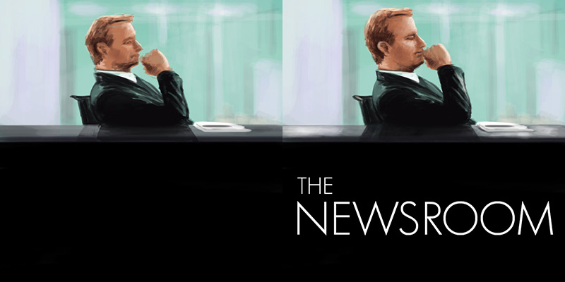
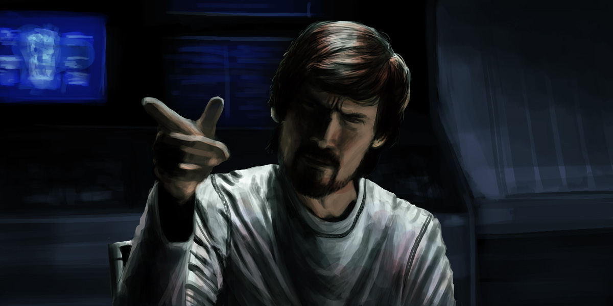
    I enjoy this show a lot, as I did it’s predecessor The West Wing. So when I happened across the iconic image of Will at the news desk I decided to do a quick paint of it, gave myself 20 minutes.

    I did finish it in that time, but I wasn’t happy with the likeness, so I spent another 20 minutes or so on it to polish it. Now it looks like Jeff Daniels at least! However I find myself liking the first image more. Maybe it’s an uncanny valley thing but I feel like the first one has more character, and especially that the lighting looks better. It’s weird.

  • Alina

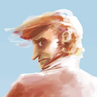
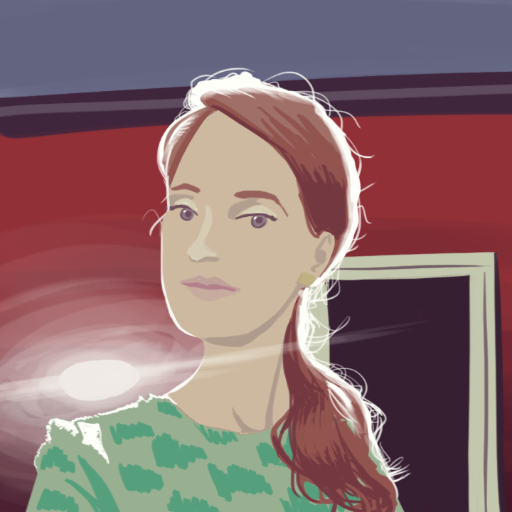
    The way strong light illuminates and scatters through hair has always been a fascinating phenomenon to me. It looks so great. Any sort of rim lighting always makes things look more interesting.

    [Update] Alina liked it.

  • De Apps Tor

    A silly play on the word App Store that made me giggle. You’ll probably only get it if you’re dutch.

  • Nikko Racer

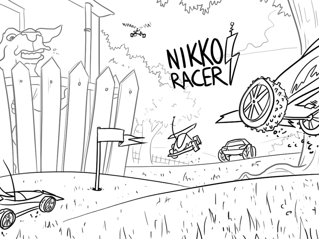
    An initial promo sketch I did for the Nikko RC Racer game that Paladin made.

  • The view

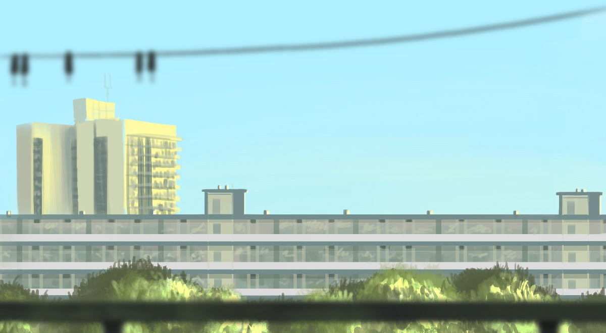
    Sometimes I glance sideways from my desk and see the most beautiful colors out of my 10th floor window. So today I decided to rotate my desk and draw what I saw.

  • “Oh, I see – you’re trying to kill me.”

    I’ve been a fan of Jeremy Davies since his excellent role on Lost, but his performance in Solaris is pretty much perfect.
    A painting exercise in photoshop, took me about an hour or three maybe.

  • Battle

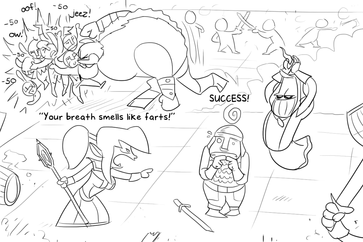
    Concept art for my current project at Paladin Studios, an honest-to-god dungeon crawler RPG!

  • dAds

    Mockups for a fashion brand’s potential father’s day campaign.

  • Gravel shit

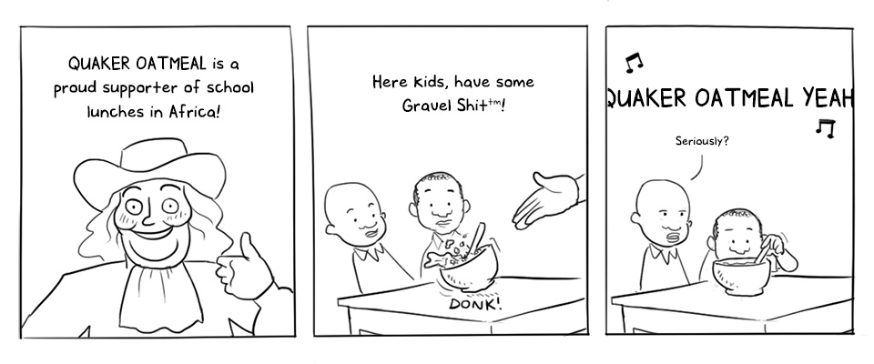
    Saw the ad at the bus stop the other day and thought how hilarious it would be if they actually gave them their oatmeal.

  • Wilde words

    After watching The Words tonight I felt compelled to paint this striking shot from the movie.
    Done in photoshop in about an hour.

    I feel this film deserves more recognition than it got, it’s a surprisingly heartfelt story about people and the mistakes they make. If you haven’t seen it, it deserves a look.